We just released 6 new reports for our users. But first, the reason behind why we created these reports. We’ve all heard the saying, “strike while the iron is hot.” But what does that mean? Let’s first take a look at the origin and literal meaning to better understand the analogy. The first documented use of the phrase was in 1566, in a comedy ‘The excellent comedie of two the moste faithfullest freendes’, featuring the characters Damon and Pithias.

This old proverb clearly alludes to the imagery of the blacksmith or farrier at his forge. If he delays in shaping the iron when it is hot and pliable, the metal soon cools and hardens at which point the opportunity is lost.
At the heart of the message is this: one should act decisively and immediately take advantage of opportunities when they arise. In business, there are various opportunities that are tied to specific windows of time. Did you know that for your industry and your audience there’s a particular time people read emails, answer the phone or even purchase things?
Unfortunately, most businesses are unaware that these windows of opportunity even exist. Think of the results you could achieve if you were sending emails when recipients were actually in their inboxes. Or if you had your appointment scheduler calling at a time when a much higher percentage of prospects answered the phone. Or if you set an expiring offer for a promotion during the time of day that your audience purchased during most.
Sounds great in theory, but you might be questioning, “how could I possibly know when these windows of opportunity exist?” I’m glad you asked. That’s where Graphly comes in.
When do my customers purchase?
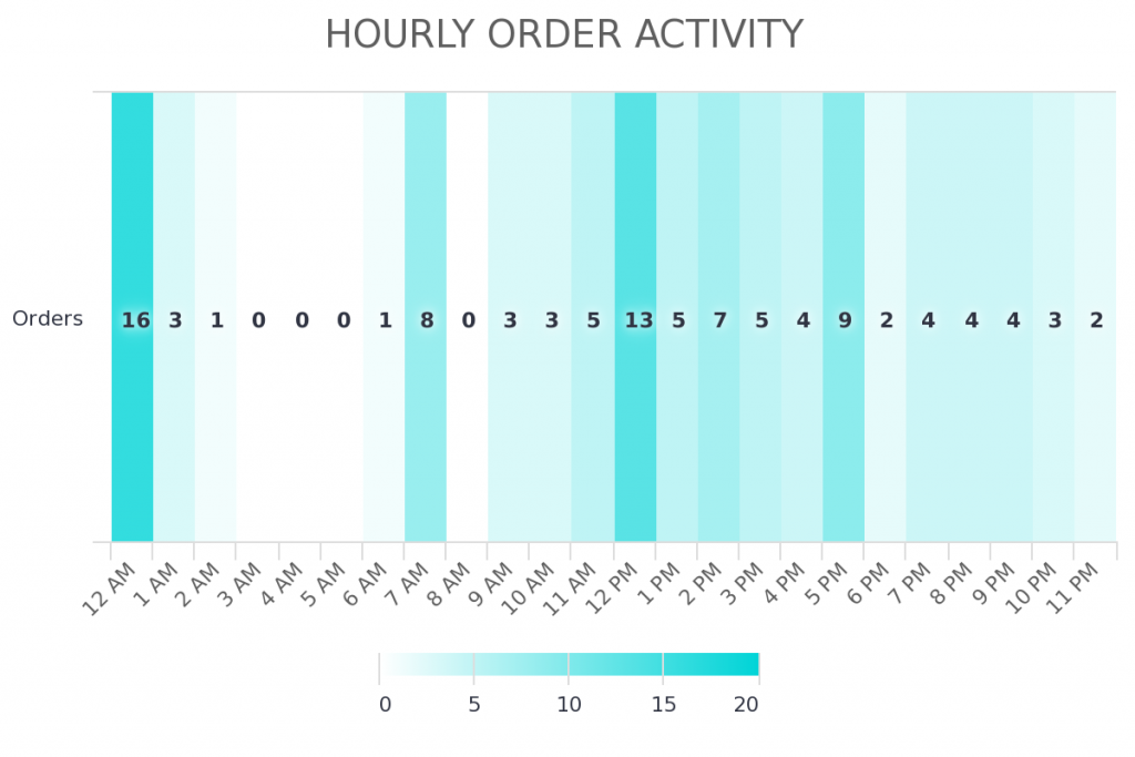
The first 3 reports that we’re releasing today are Daily Order Activity, Hourly Order Activity, and Daily & Hourly Order Activity. These are shown in heat map form to clearly portray the days of the week and the hours of the day where you generate the most orders (based on your own data of course).

When do my prospects do X?
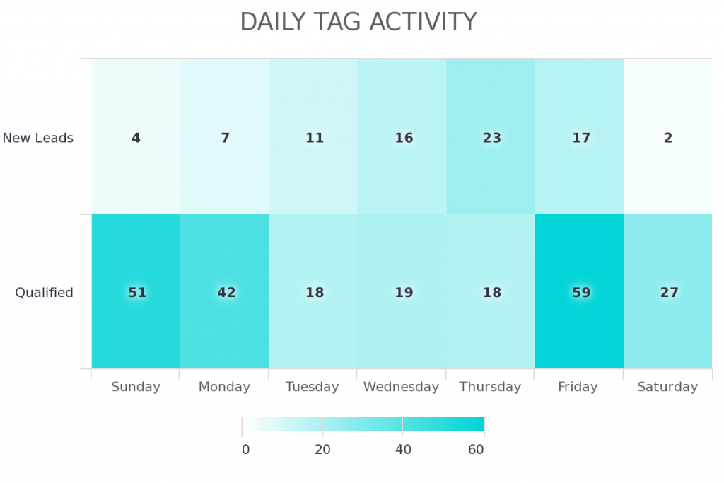
The next 3 reports can be used to see when you get a particular kind of lead, when that lead answers calls, when that lead schedules appointments with you, when a new customer onboards, you name it. These 3 reports are tag based which means you can build a report to measure almost any process in your business where you apply a tag to a contact record when a certain event occurs or when an objective is met. They are Daily Tag Activity, Hourly Tag Activity, and Daily & Hourly Tag Activity.

When does my list engage with emails?
We’ve had 3 reports that dispel the mystery of when your list engages with the emails you send them for a couple of years now. They are Daily Email Engagement, Hourly Email Engagement, and Daily & Hourly Email Engagement.
Savvy Graphly users have been able to ignore the so-called “gurus” who profess a universal day and time combination, that supposedly works for every industry and every audience. Instead, our users have leveraged these insights to communicate not on a schedule that’s best for them, but on a schedule that’s best for their prospects and customers. The results have been astounding. It is because of the success of these Daily & Hourly Email Engagement reports that we decided to tackle orders and tags. And who knows, opportunity activity could be in the not too distant future if we receive enough customer requests for it.
Find out when your “Iron Is Hot”
These 6 new reports are super simple to set up. Log in to your account now to reveal the uncovered opportunities in your business that are just waiting to be tapped into.
Warning: Don’t misinterpret the data
As powerful as these reports are, you can pretty easily misinterpret the data or come to some inaccurate conclusions. For example, if you’ve been using Keap for a couple of months and you set up all of your campaigns to send emails on Tuesdays and Thursdays at 10am, you might see a spike in opens and clicks shortly after 10am. You might think, “Wow, that guru was totally right. This is when people open emails.” Or, if you’re making phone calls on Wednesday afternoons and at no other time, the report will validate that you reach people on Wednesday afternoons. That doesn’t necessarily mean it’s the most opportune time to call them.
You can avoid making decisions on false data by running tests. For example, vary the days and times that you send emails. Do the same thing with prospecting calls or promotion deadlines. Spread out your efforts evenly across days and times for a few weeks and you’ll then be able to look at the data and confidently draw accurate conclusions from it.
* Side Note
To help you avoid skewed data, we realized that those using the new Order reports might have their hourly data weighted very heavily if recurring subscription payments were included since Keap batches those to the merchant account nightly. So we remove those results and only count the first payment in a subscription (when the customer signs up).
* Feedback
I think there are so many use cases for the tag report. We’d love to hear how you plan to use these reports and what you intend to measure. Feel free to share your ideas in the comments section below or drop us a line once you have your reports set up.
Happy Charting!


