After pouring through lots of data (something we geek out on), the numbers show that the most successful Keap users also use additional software products that integrate with Keap. As the number of integrations increases, the likeliness of canceling Keap decreases. Essentially the additional value provided by 3rd party software helps users actually obtain the desired results they had when originally signing up for Keap.
Spoiler Alert: If you’re new to Keap, you will likely purchase an “add-on” or “plug-in” to help you execute a unique strategy or reach a specific objective. Keap simply can’t do everything your funnel, system or process requires.
One Board To Rule Them All
Based on this information, we concluded that pulling Keap data into visual dashboards isn’t sufficient to achieve our goal of helping Keap users succeed. Rather, we need to bring data in from Keap and the many software tools and services that connect to it. One dashboard to view all of your data. A single source of truth.
This is a large endeavor. One that can’t be realized over night. Instead, we’ll carry it out in phases.
Phase 1: Integrate with select service providers.
Phase 2: Allow data to be fed to Graphly via Google Sheets.
Phase 3: Release a public API so data can be sent to Graphly from any source.
Today marks Graphly’s first steps down the path of an all-in-one dashboard (or at least a most-in-one dashboard). Phase 1 should move pretty quickly. And here’s where we’re starting…
Fix Your Funnel
A brief history for context…
A few years ago we signed up for Fix Your Funnel’s Dialer. It was a game changer for our small sales team. Overnight we were able to place 2-3X the numbers of calls we were previously making. This meant more attempts per prospect were being made. We also obtained better results because of the additional SMS features we used as part of our overall contact strategy. And because it integrated so tightly with Keap, it allowed us to leverage additional automation and added a layer of transparency on the contact record regarding calls and call attempts that previously did not exist.
Inconvenient Challenge
The challenge however, was clearly monitoring our efforts and results at both a micro and macro level. While Fix Your Funnel had some basic reports they offered, at the end of the day, they were in a different location than where we usually go to measure our core funnels and sales pipeline – GRAPHLY.
After some polling, we discovered we weren’t the only ones who wanted to see our phone efforts on a Graphly dashboard. Turns out there’s a significant amount of overlap that already exists between our two user bases. Fix Your Funnel also happens to have a team that provides phenomenal customer service (something we pride ourselves on).
So when it came time to select our first data source outside of Keap, Fix Your Funnel was an easy choice.
Measuring Sales Teams
We all know the ultimate metric when measuring sales is closed revenue. Signed, sealed, delivered. No level of effort or results beats money in the bank. But, there are indicators that will help you identify strengths, weaknesses and opportunities for growth and improvement that ultimately result in increased bottom line revenue. If you manage a sales team or even a single sales person who sells via phone, you should be tracking these core activities:
- Attempts
- Contacts
- Conversations
- Appointments Scheduled
- Proposals
- Closed
Feel free to adjust this list of activities to fit your unique sales process. Once you’ve done that, consider the various aspects about each activity you’ll want to measure. We asked ourselves this question as we began to build out the Fix Your Funnel Dialer reports.
While our work has only begun with Fix Your Funnel’s Dialer, here’s a list of the reports included in version 1:
Outbound Calls
This report shows the total number of outbound calls placed.
Outbound Calls Goal
This report allows a goal to be set for the number of outbound calls and displays your progress toward that goal.
Inbound Calls
This report shows the total number of outbound calls placed.
Outbound Talk Time
This report shows the outbound talk time in minutes.
Inbound Talk Time
This report shows the inbound talk time in minutes.
Outbound Talk Time Goal
This report allows a goal to be set for the minutes of outbound talk time and displays your progress toward that goal.
Inbound Talk Time Goal
This report allows a goal to be set for the minutes of inbound talk time and displays your progress toward that goal.
Outbound Average Call Duration
This report shows the average duration of each outbound call in minutes.
Inbound Average Call Duration
This report shows the average duration of each inbound call in minutes.
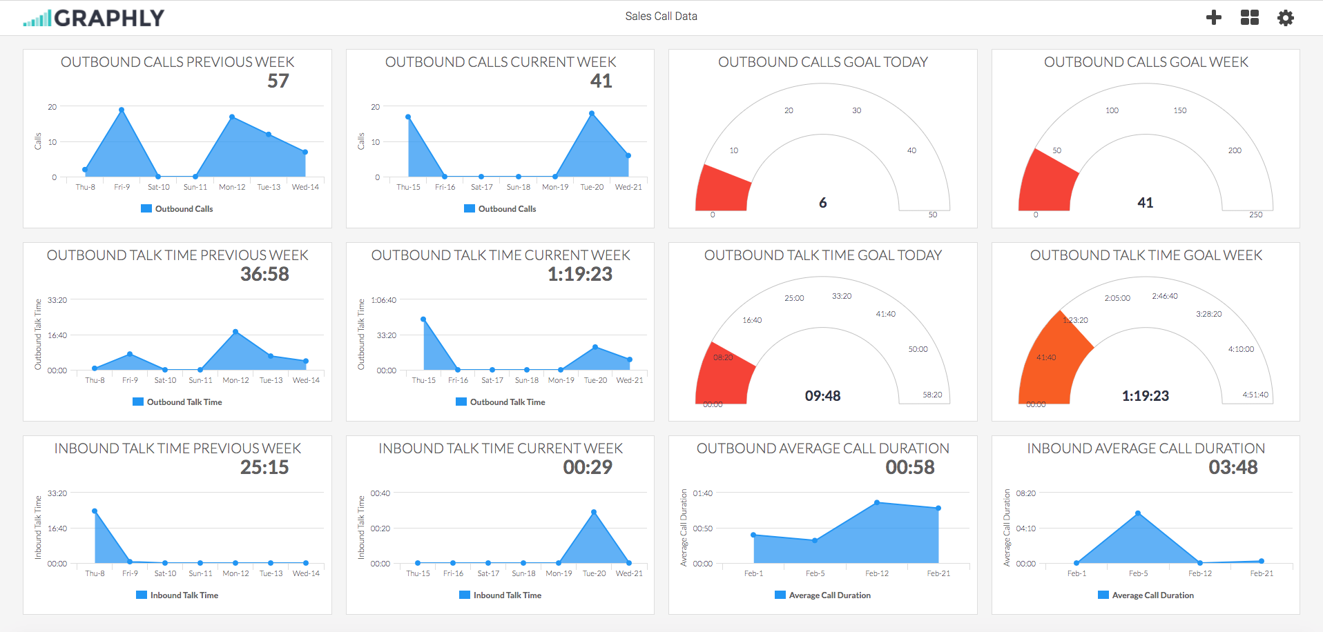
Sample Fix Your Funnel Dashboard
(Click Image to Expand)
* This dashboard was configured with the least amount of clicks and simplest settings possible. These reports can be grouped by Team Member, Phone Number or Outcome Type. You can also customize them further with the Options and Criteria Builder tabs.
Coming Soon
Here are additional Fix Your Funnel Dialer reports we’ve considered building:
Inbound Calls Goal
This report allows a goal to be set for the number of inbound calls and displays your progress toward that goal. Initially we removed this report from our launch thinking, “inbound calls is out of your control so it seems weird to set a goal for it.” After completing the reports above and giving this one a little more thought, we realized this report is super valuable, but probably to a different department, Marketing. Many advertising efforts utilize a phone call as the CTA (call to action). Like clicks or visitors, a marketing department would certainly have goals for making the phone ring. So we’ll be including this one on our next round of dialer reports.
Total Talk Time & Total Talk Time Goal
The common range we see organizations pushing for on a total talk time goal fluctuates between 3-5 hours per work day. We recognize that the reports above break the talk time down by the direction of the call (outbound and inbound). We’d like to sum all calls, regardless of direction, into a single chart as opposed to requiring our users to add side by side reports and either do math in their head or on paper to obtain the total talk time figure. These two reports are super low hanging fruit we intend to pluck.
Call Outcomes
This report shows the outcomes or dispositions selected at the close of each call. Shown in a pie chart, it gives you a sense of how effective your team or individuals on your team are at achieving certain outcomes on their calls. We really wanted to squeeze this report into our initial release but due to the release of other reports and features, we had to hold off. We already know you’ll love it when it arrives. In the mean time, choose one of the reports above and group by Outcome Type.
Connection Rate
This report takes the amount of connections, divided by the total outbound attempts made for the same time frame, to calculate your connection rate. If you know that it takes your business 7 calls to get 1 person on the phone, this information helps you begin to understand the number of calls you need to be making on a daily and weekly basis to achieve your goals.
Daily & Hourly Phone Engagement
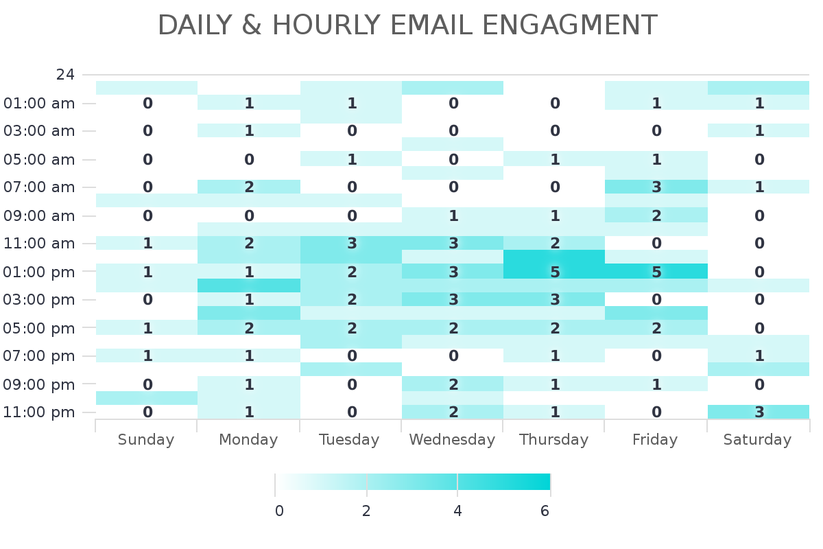
If you’ve used any of our 13 email reports, you’ve probably seen and love our Daily & Hourly Email Engagement report (see the heatmap below this paragraph). It shows you the days and hours when subscribers engage most with your list. No need to blindly follow a blanket suggestion from some “guru”. Simply send when your specific list engages most. This report would perform the same way. When do you make the most connections? By measuring phone engagement, you can remove the guess work and hypotheses, and begin calling your prospects when they are most likely to answer.

There are other Fix Your Funnel Dialer reports we’ve thought of that we’re not mentioning here. Before we move forward on any new development, we’d like to first take time to allow our users to implement these new reports, test them out, and give us feedback.
What reports are missing from Graphly that would help you better measure and improve your phone efforts?
Future Webinar Alert
Want to learn more? In the next few weeks we’ll be putting together a webinar with the Fix Your Funnel team. Keep an eye out on your inbox and inside Graphly for your special invitation. In the meantime, LOG IN to your Graphly account and set these reports up (assuming you’re already a Fix Your Funnel user). If you’re not yet a Fix Your Funnel user, check out their $1 trial. They’ll likely improve your sales efforts and results like they did ours.
Who’s Next? You Decide!
We’ll continue working with Fix Your Funnel to develop new reports for their dialer. There are also a handful of insights we’d like to provide around their SMS service. But here’s where you get to help us prioritize our upcoming integrations. What other software services should we be looking at? We’ve got our own list from having been in the Keap space for 14 years now. But we want your feedback. We want to make sure we’re building reports that will make the biggest impact for the largest segment of our customers. Your input can and will adjust our pursuit of future data sources. Add your wants, wishes and desires in the comments section below.
Happy Charting!


