This is an incredibly sophisticated report that scores your paying customers and groups them into segments by your very best customers, your very worst customers, and everyone in-between. To begin, click the “+” icon on your dashboard. Then type “RFM” into the search bar and click the “RFM” widget.
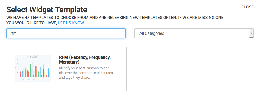
Chart Tab
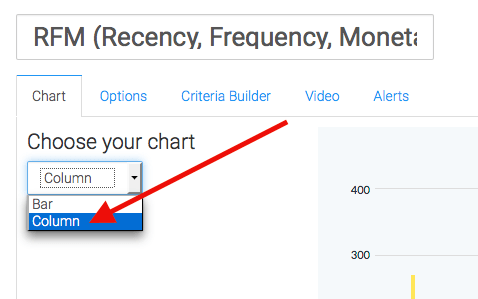
First, select your chart type. I’ll select Column.
Customize Weighted Assumption
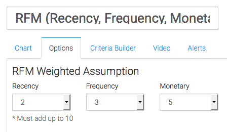
Now, let’s move to the “Option” tab. Let it be known that all transactions within the last 24 months will be considered. The first thing we need to do is customize our weighted assumption.
- Recency: Deals with how long ago a customer had a Transaction with your company.
- Frequency: Deals with how many Transactions a customer has had with your company.
- Monetary Value: Deals with the revenue associated with any and all of your customer’s transactions.
How this is weighted will be different for every business. Many small businesses will have frequency set to 5, because cash flow is very important. Setting frequency to 5 is stating that essentially repeat business is most important of the 3 options. Perhaps you have a business with low-priced front end products and really big ticket items on the back end. In that case you’d want to set Monetary to 5 if you consider big spenders your very best customers. Take a moment to think about your own business and what drives the best results for you. What makes the best customer? Is it Recency, Frequency, or Monetary Value? Weight your calculation accordingly. You can always come back and make adjustments later.
Options Tab
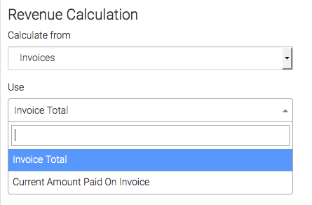
Now for the way we calculate revenue. You can choose from Invoices, Payments, or Opportunities.
Selecting Invoices
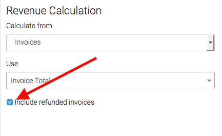
If selecting invoices, you can use the invoice total or the current amount paid on the invoice. By default, refunded invoices will be excluded unless you check the “Include Refunded Invoices” box.
Selecting Opportunities
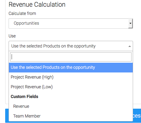
If selecting opportunities, you can choose from products that have been added, the projected high or low, or even custom opportunity fields.
Select Won Stage
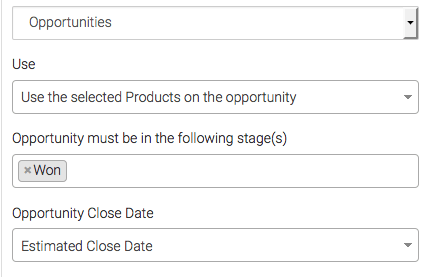
Then you can select your Won stage.
Selecting Close Date
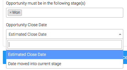
As for determining the Opportunity Close Date; You can either select the “Estimated Close Date“, which is nice because you can edit it after the fact. Or you can select the Date the Opportunity was moved into the current stage, essentially the date you moved it to “Won“.
Percentage Options
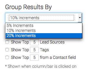
The next section really changes the way your graph will look, as it allows you to create groupings of 5%, 10%, or 20%. So if you want to see 5 columns you’d select the 20% option.
Trends & Insights
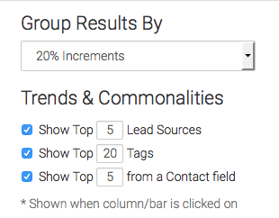
Our last option here is what “Trends & Insights” you want to have displayed, and how many. I’ll select all 3 options and adjust the numbers. Each of these input fields will have a max of 25.
Criteria Builder
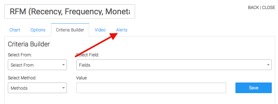
For ultimate control and customization, use the “Criteria Builder” to include additional rules and requirements to the report.

Alerts Tab
Lastly, feel free to set alerts in the Alerts tab for if your values rise above, or fall below a threshold of your choosing.
Relevant Articles
If you don’t already have a Graphly account, you can sign up for free here to get powerful Infusionsoft reporting.

