Placement refers to the location ads are placed.
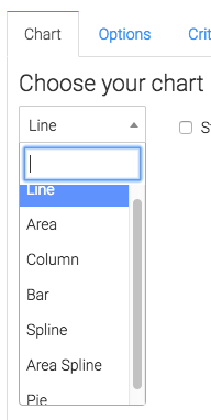
From the chart tab you’ll see that there are seven different types of charts to choose from.
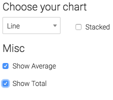
We also have the ability to stack the results by showing the average and total in the top right corner by checking these boxes.
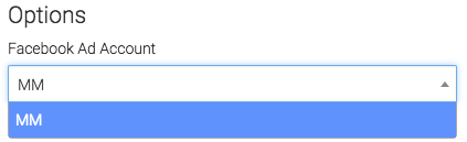
Now lets go to the options tab
First we need to select the Facebook account we need to build the report for.
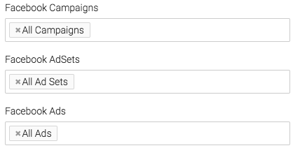
Next, we can narrow down our results by looking at specific campaigns, ad sets, and ads.
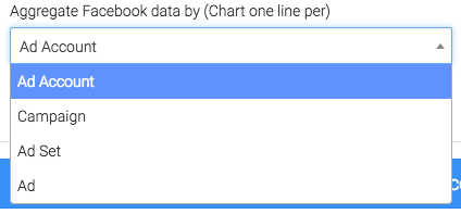
Under the Aggregate Data section a unique line will be created for the option we select.
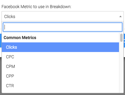
From this dropdown we will select the Facebook metric to breakdown by placement.
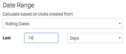
Now let’s change the date range.
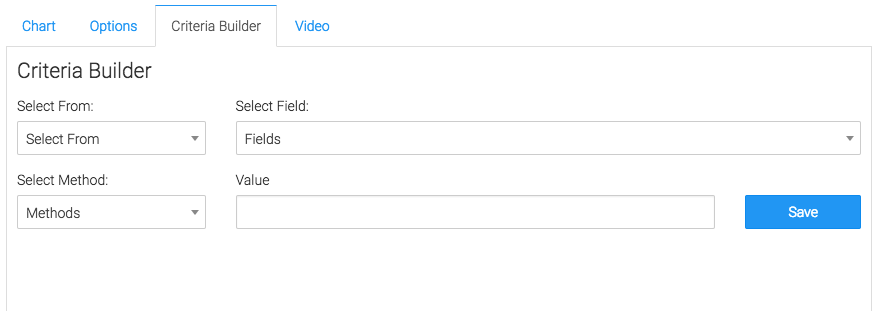
For ultimate control and customization use the “Criteria Builder“.