The Appt|Note|Task by Action template allows you to compare the results of one Action type to another Action type. This is perfect for companies who place calls and wish to compare the number of connections they make vs the number of voicemails they leave. But of course, there are many other ways to use this.
Search for the Appt|Note|Task Template
To begin, click the “+” icon on your dashboard and type “Appt” into the search bar. Then, select the Appt|Note|Task By Action template.
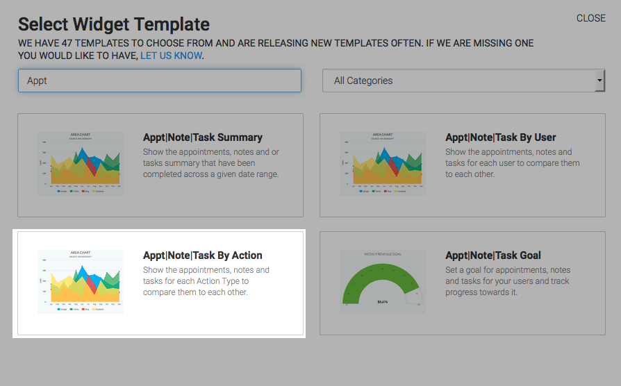
Chart Tab
Display Type
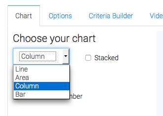
There are four different options available to you for your chart type. All will work, but since you are comparing charts side-by-side, I’ll use the Column type.
To Stack, or Not to Stack?
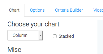
You can choose to stack or not stack the results. Stacking can make it a little more challenging to clearly see leaders and last placers. On the flip side, it does nicely total all types together for each interval displayed.
Miscellaneous
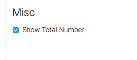
Lastly, check the Show Total Number box to see the value in the top right-hand side of the graph.
Options Tab
Record Type
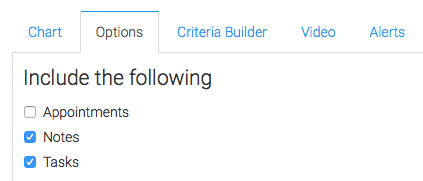
Navigate over to the Options tab. First select the type of records you want to include in the report. I’ll check Notes and Tasks.
Value to Show
Because both the contact note and contact tag relations ship is 1 to many (i.e. You can leave multiple voicemails for a single contact) resulting in multiple notes and tasks completed, it’s important for you to decide whether you want to display your results summarized by people, or whether you are wanting to see your results detailed by total efforts completed.
So let’s select the value to show. Choose the first option to show the total number of Notes and Tasks. Choose the second option to show the total number of unique contacts with these.

Date Range
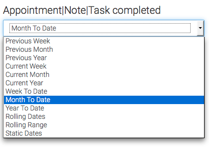
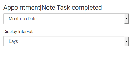
Next, set the date range you want to look at. I’ll look at Month to Date and break it down into Days.
Display Interval
Criteria Builder
For ultimate control and customization, use the Criteria Builder to include additional rules and requirements to the report.

Once you have your alerts set, click Save Preferences on This Widget.
Relevant Articles
- How to Set Up the Appointments, Notes Tasks Summary Report
- Appointment Note Task by User
- Appointment Note Task Goal
If you don’t already have a Graphly account, you can sign up for free here to get powerful Infusionsoft reporting.

