Graphly has over 100 reports to choose from. This short guide will give you a brief introduction to adding a new report to your dashboard.
Template Library
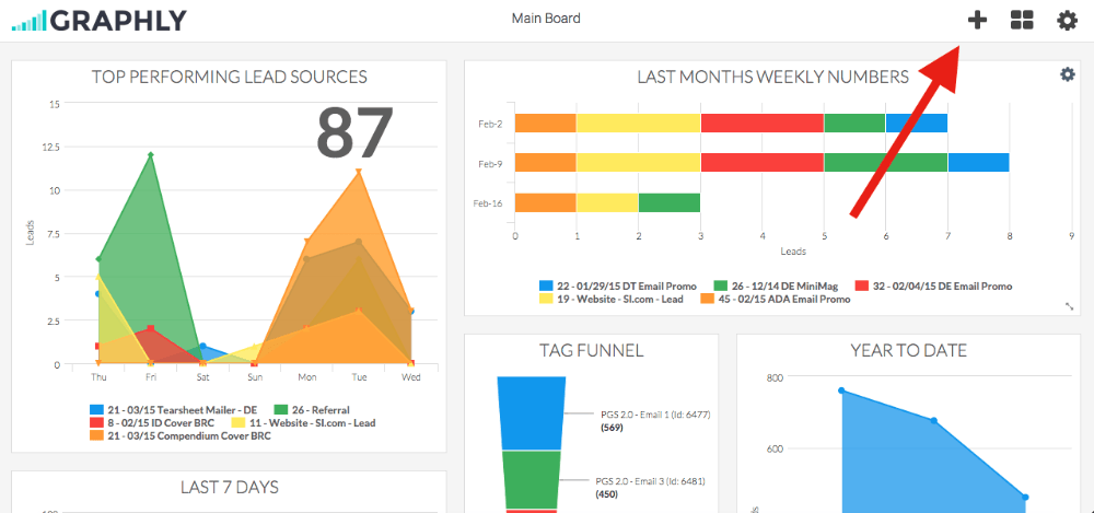
To add a report select the “+” symbol in the top right corner.
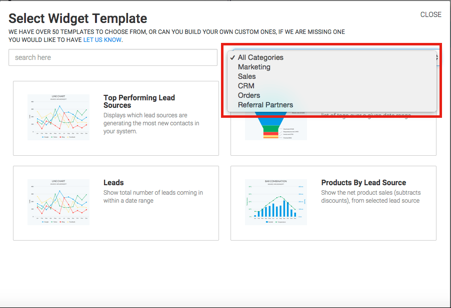
In the graph menu screen you get the option to choose all the graphs we currently have available. We are adding new graphs all the time. You also have the option to filter the graphs by category.
Choose a Category (Optional)
Once you find the graph you would like to configure select it. In this example I am going to select the graph “Top Performing Lead Sources“.
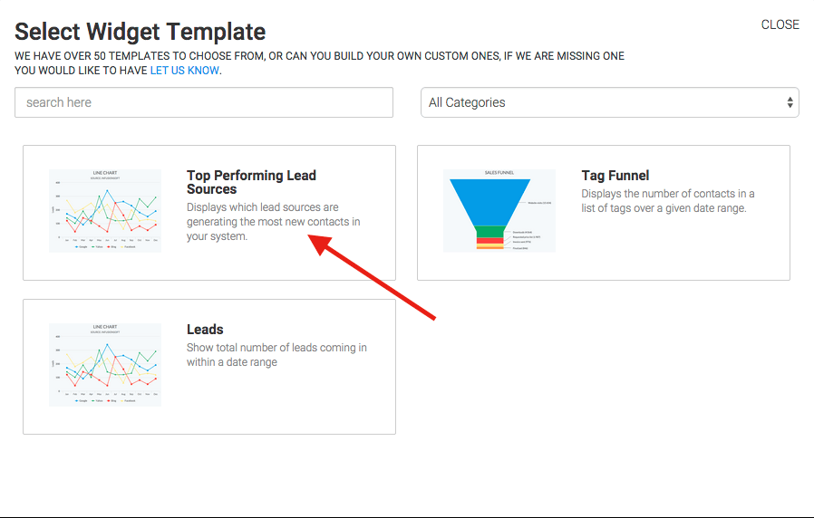
Chart Tab
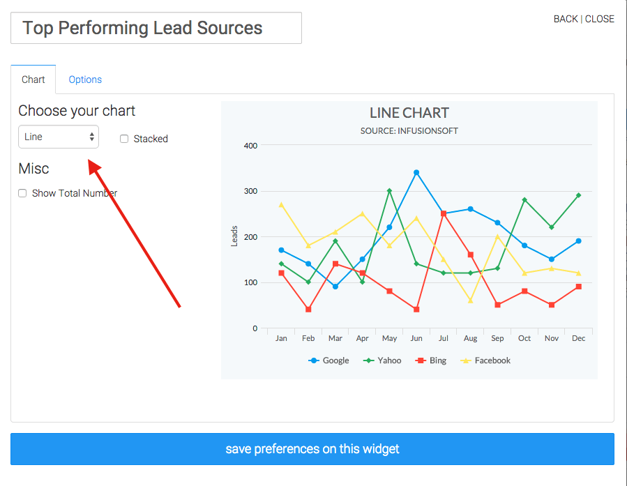
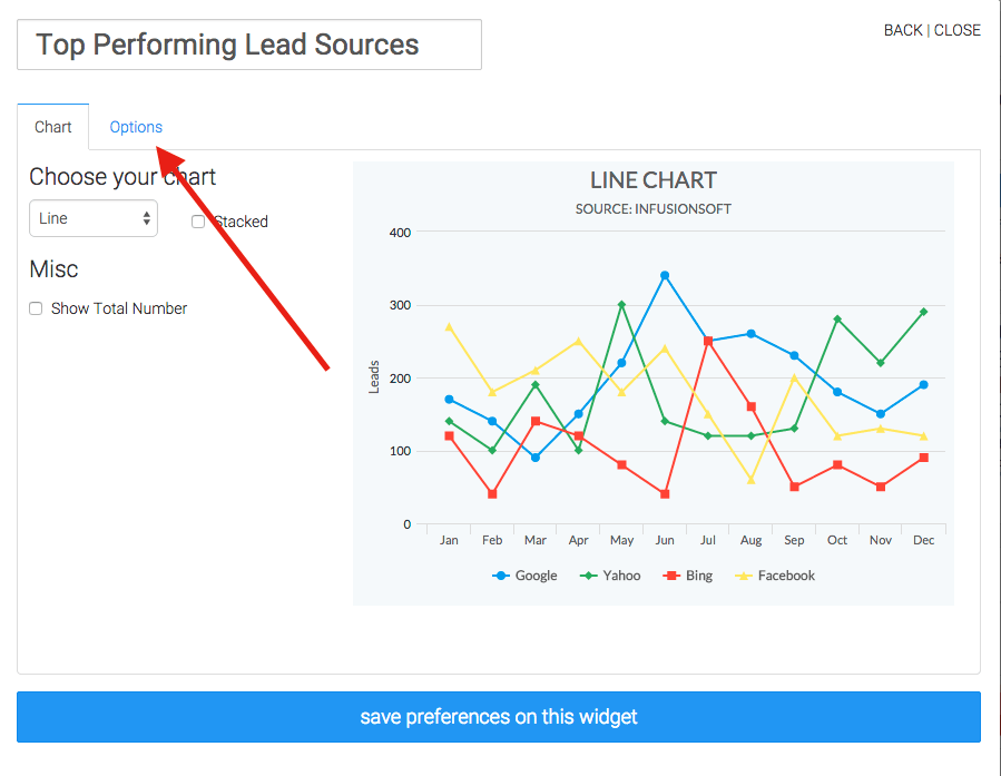
You now have the option to customize how you will see the data. Select the type of graph you want.
Options Tab
You can customize more by selecting Options.
Date Range
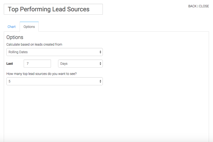
Now you have the option to select the time frame of data you are interested in.
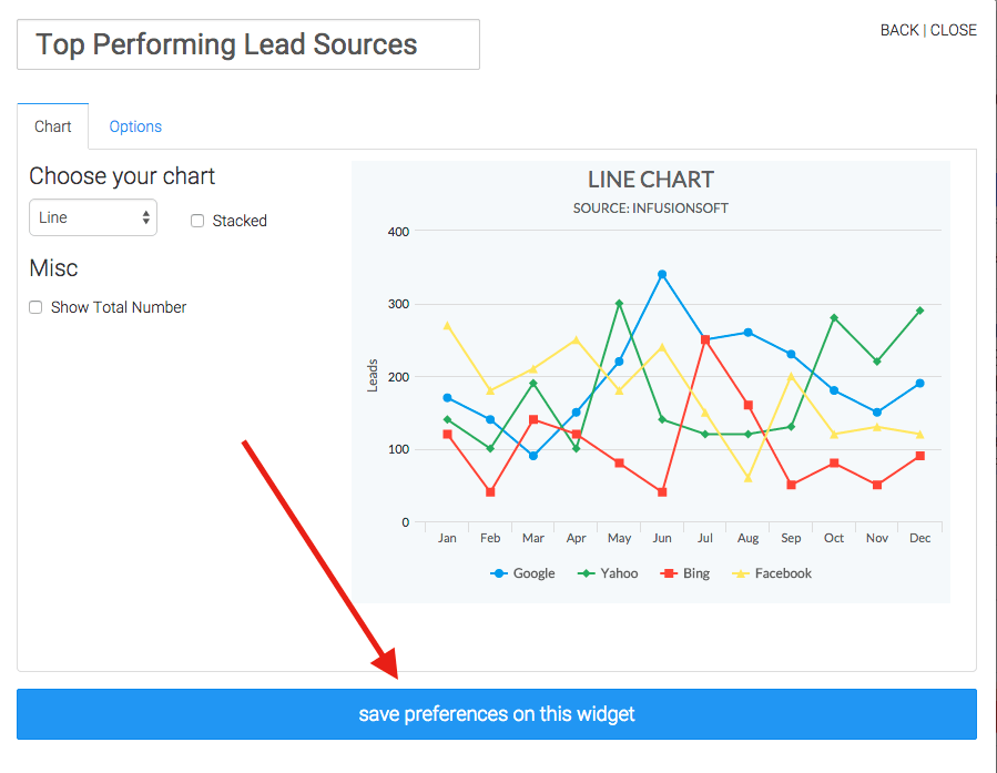
When all the settings are to your liking make sure you save them by selecting Save Preference on this Widget.
Relevant Articles
- How to Add Another Infusionsoft Application to Graphly
- How to view Graphly inside your Infusionsoft account
- How to Add Users to your Graphly Account
Create Your Free Graphly Dashboard
You don’t need to struggle to find the data you need from your Infusionsoft or Keap application. Create a free visual dashboard using the Graphly Lite plan. Using Graphly Lite, you get 1 user, 2 dashboards, and access to our 10 most widely used report templates. These templates include:
- Tags Applied
- Tags Applied Goal
- Leads
- Gross Revenue
- Appt | Note | Task Summary
- Email List Health
- Refunds
- Campaign Email Stats
- Text Widget Area
If you don’t already have a Graphly account, click here to get a Graphly Lite account so you can start making more informed decisions and grow your business.


